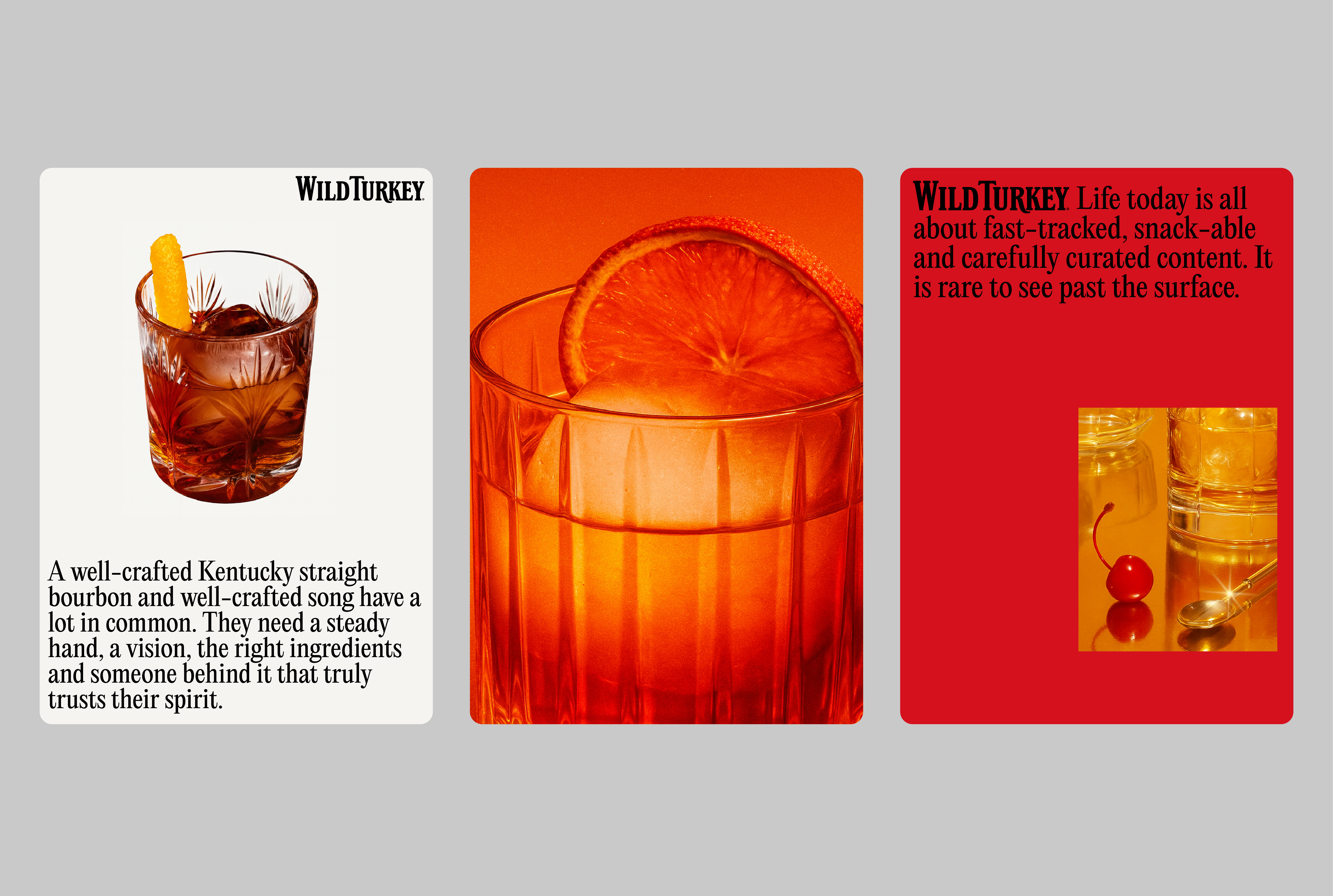
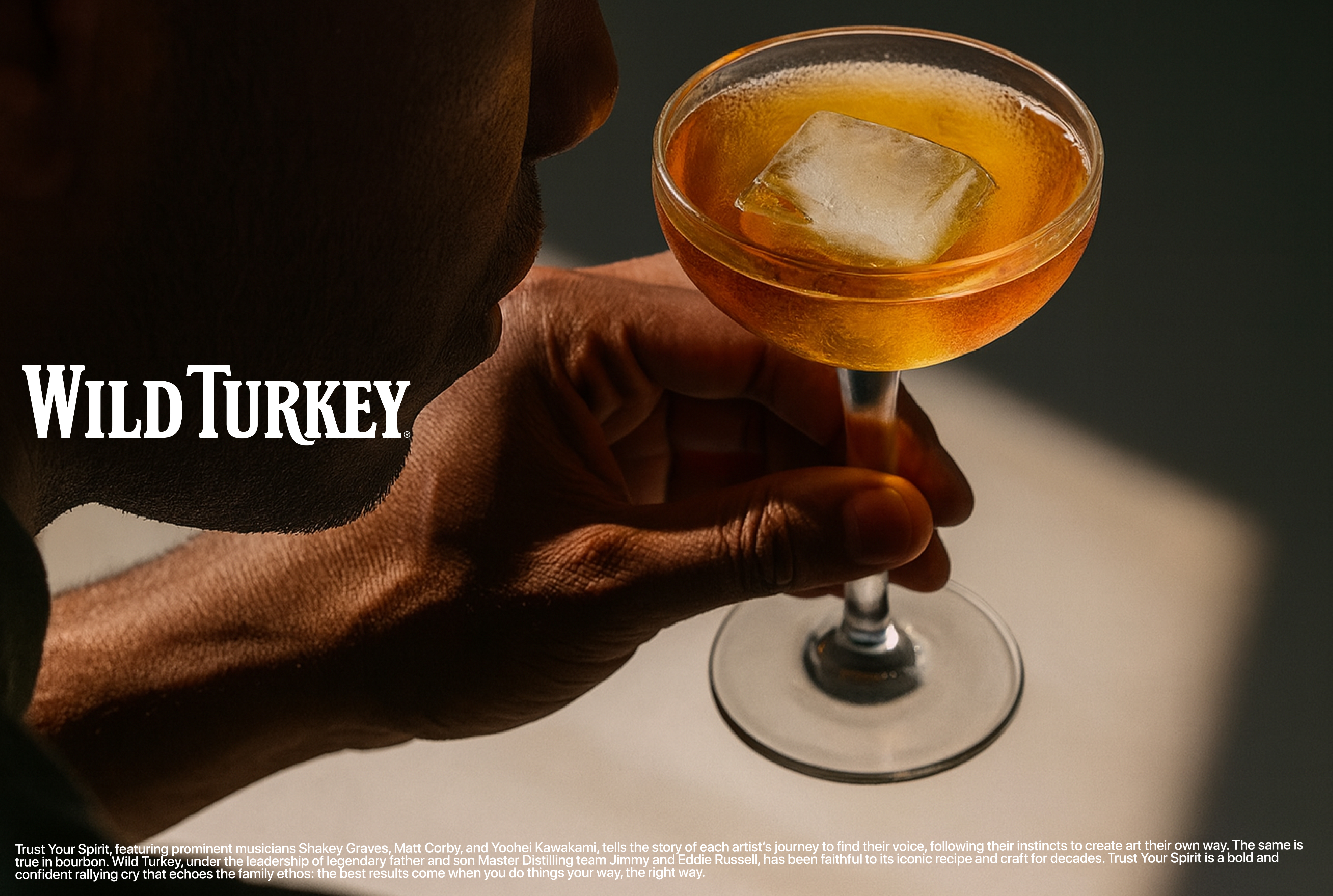
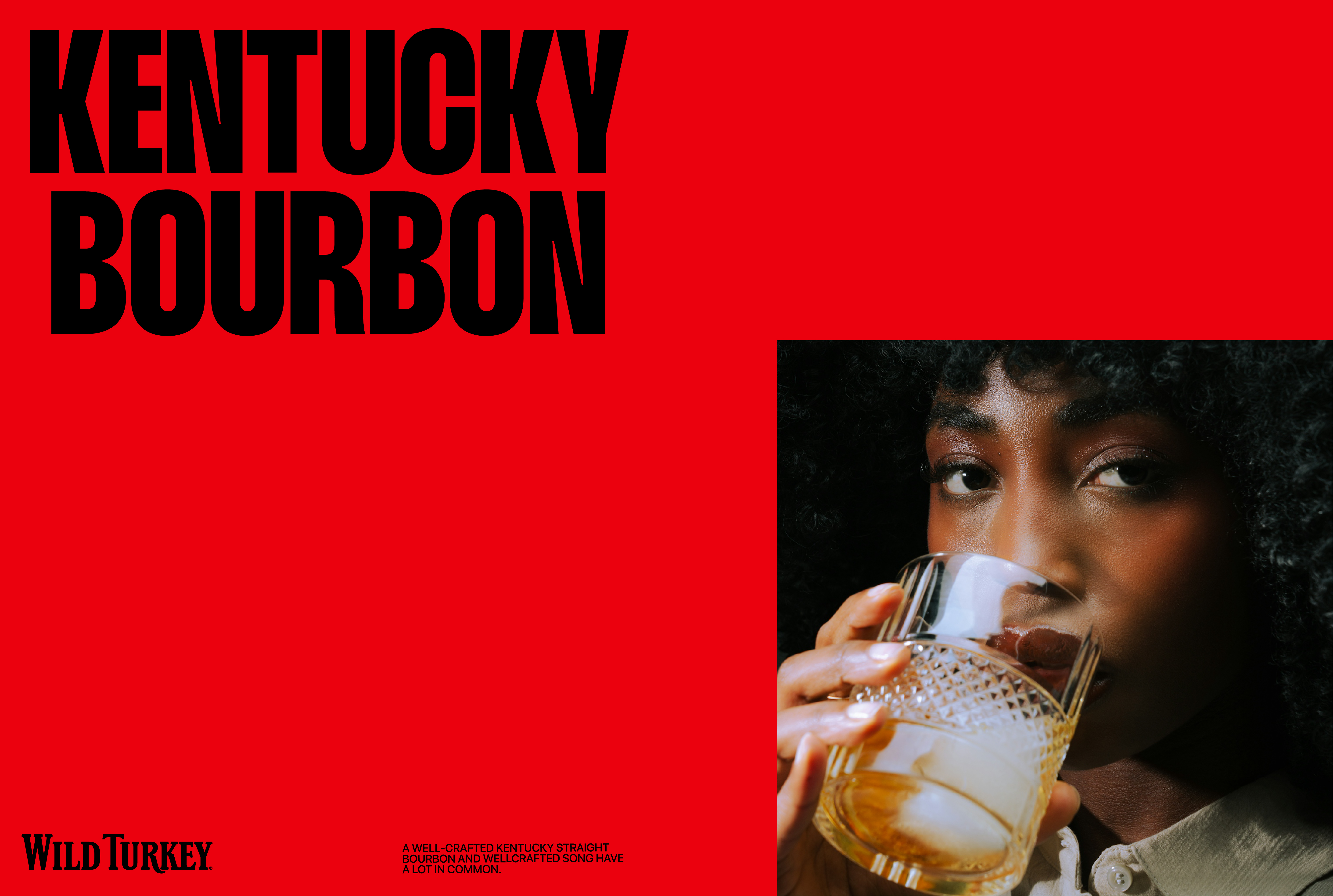
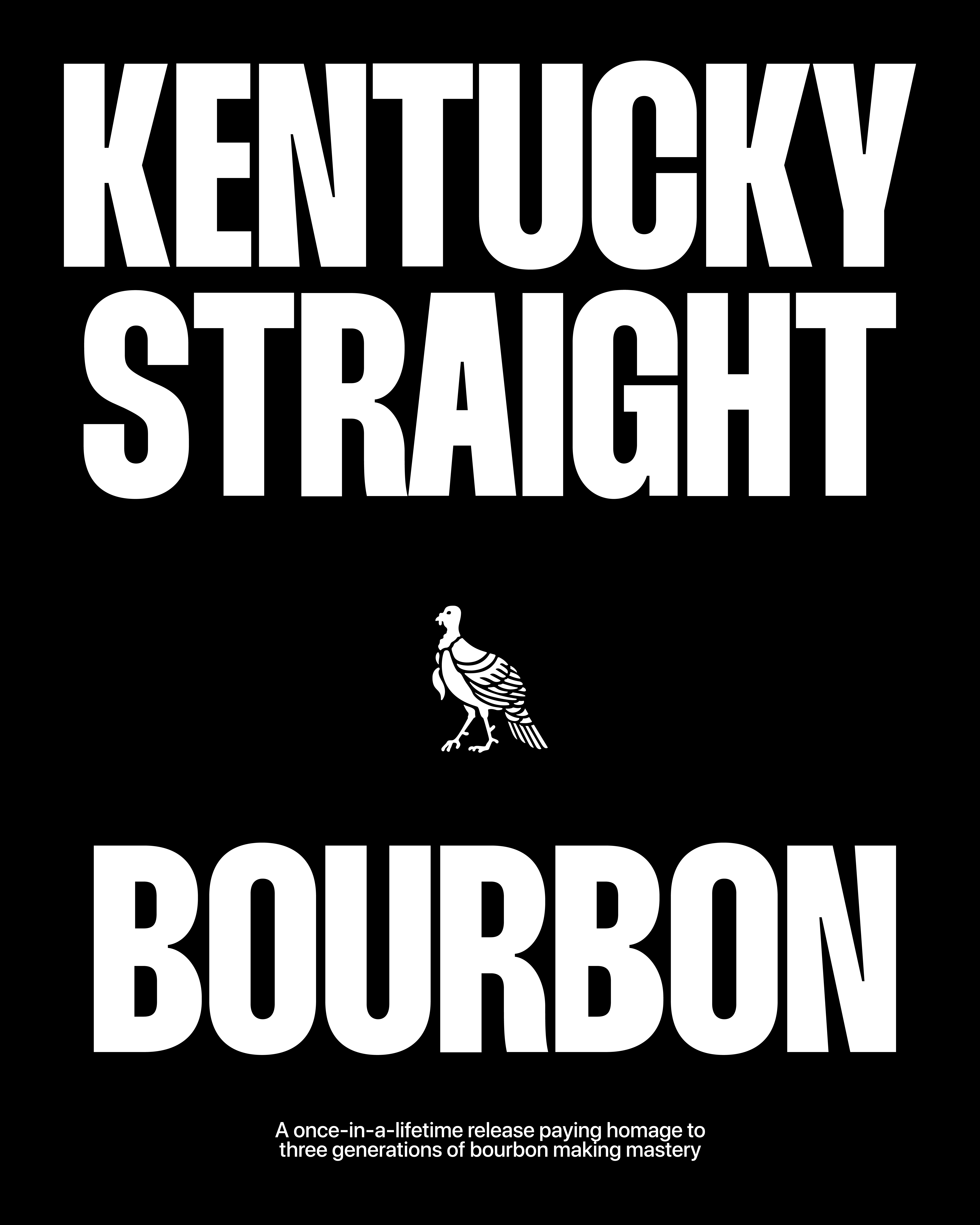
WILD TURKEY
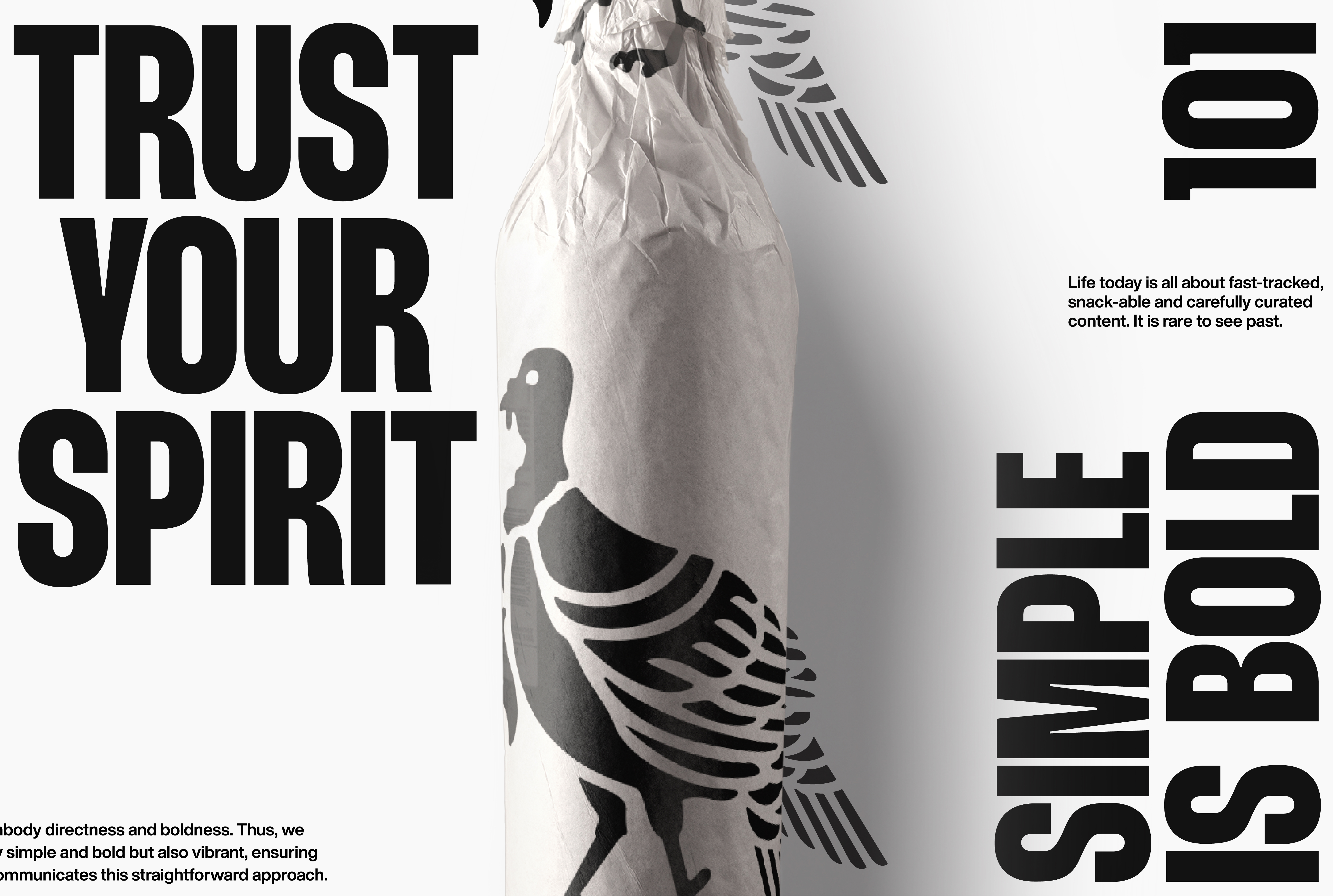
The updated identity refines what makes Wild Turkey iconic — simplifying to amplify.
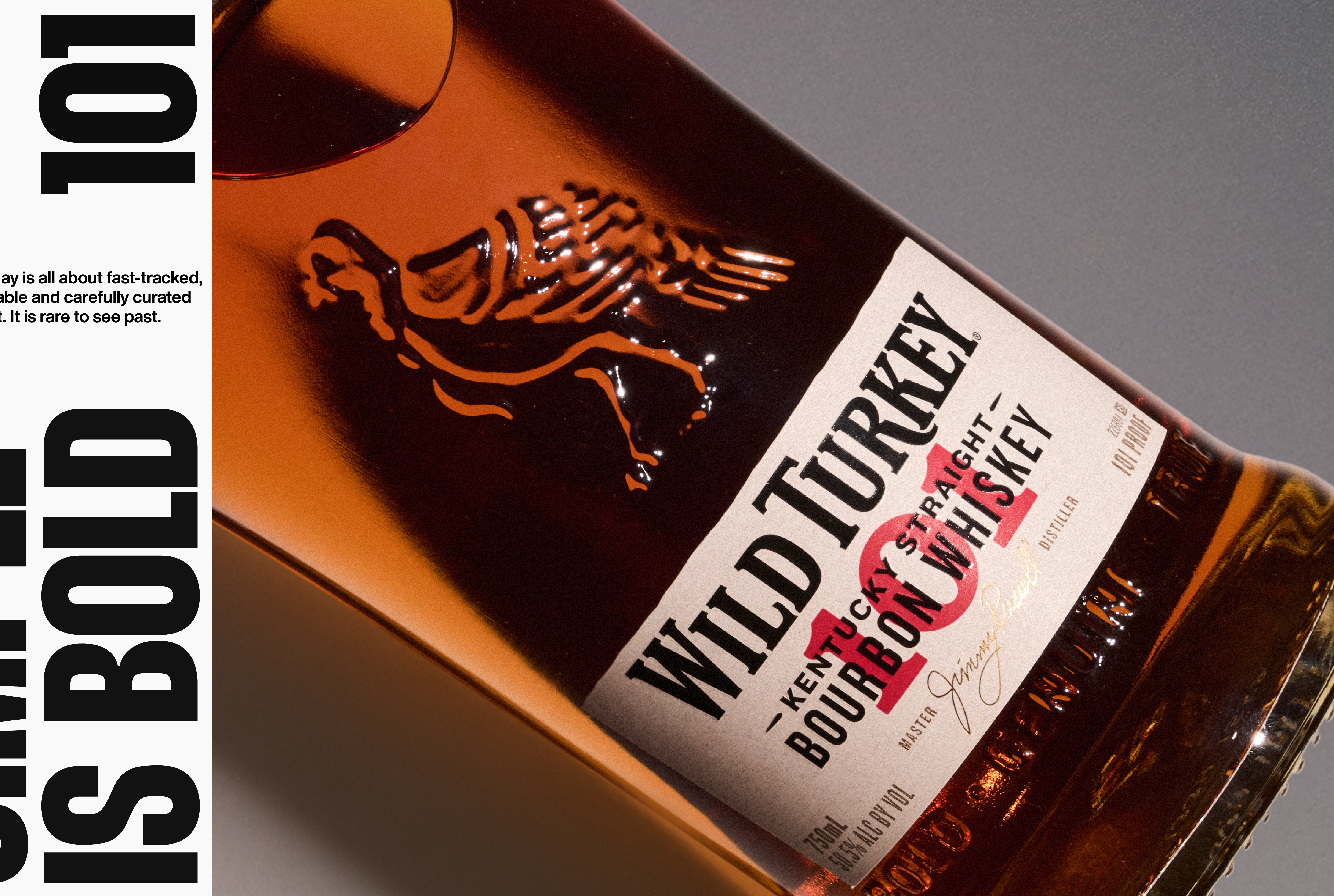
We removed the illustrative turkey from the logo to elevate the wordmark as the brand’s most powerful asset. A stacked variation increases flexibility, while the adoption of Thunder LC typography adds boldness and clarity.
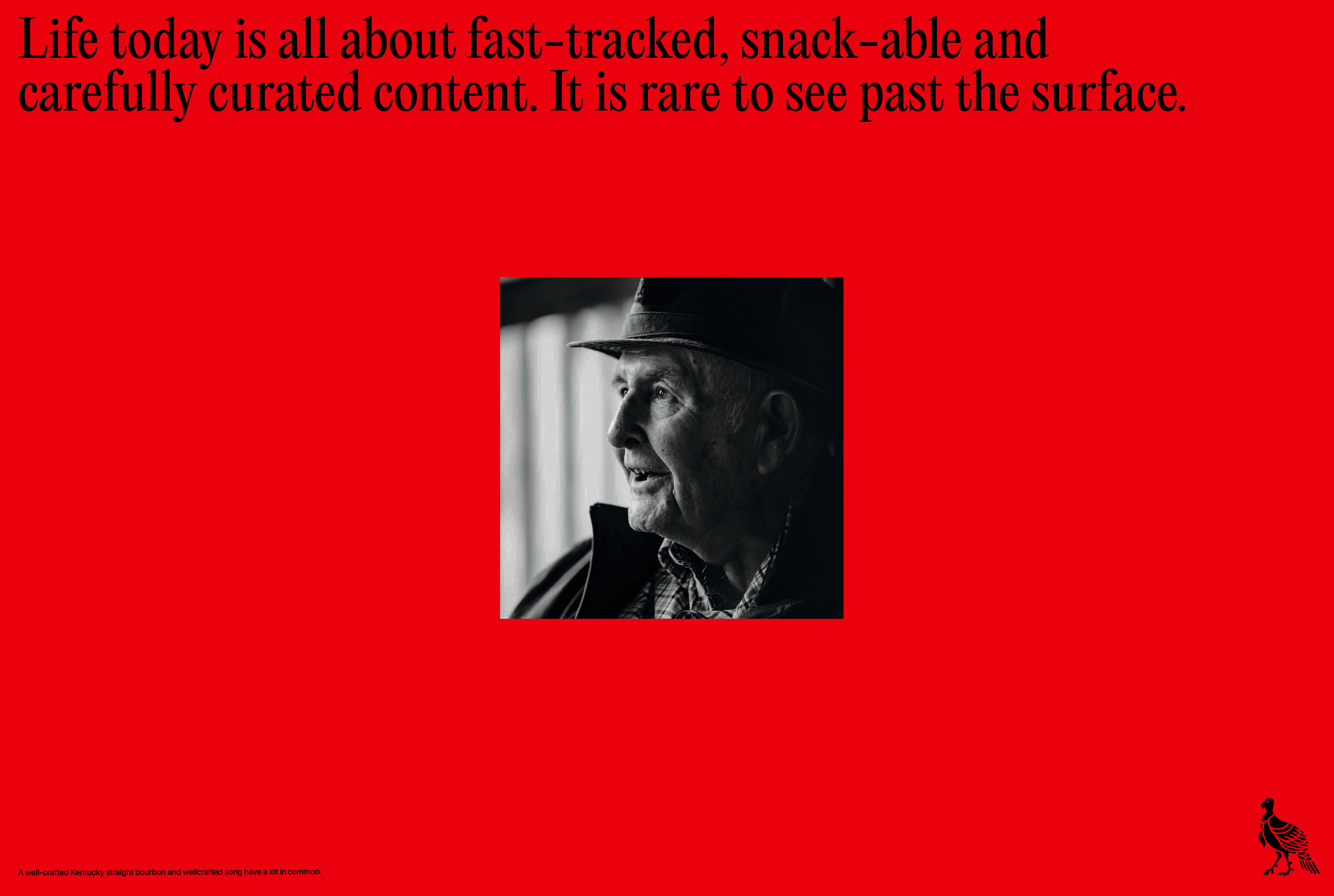
The color palette was enhanced for vibrancy and contrast, removing dated tones and reinforcing a premium, modern feel. Supporting elements — textures, photography, and layout — follow a clear direction: premium, modern, bold.
A modular, expressive system built to let the product — and the spirit — speak for itself.
Role: Creative Director
Studio Tempo®
Designers: Pedro, Luiz Pereira
Project Manager: Catharina Rocha
Agency: GUT Miami