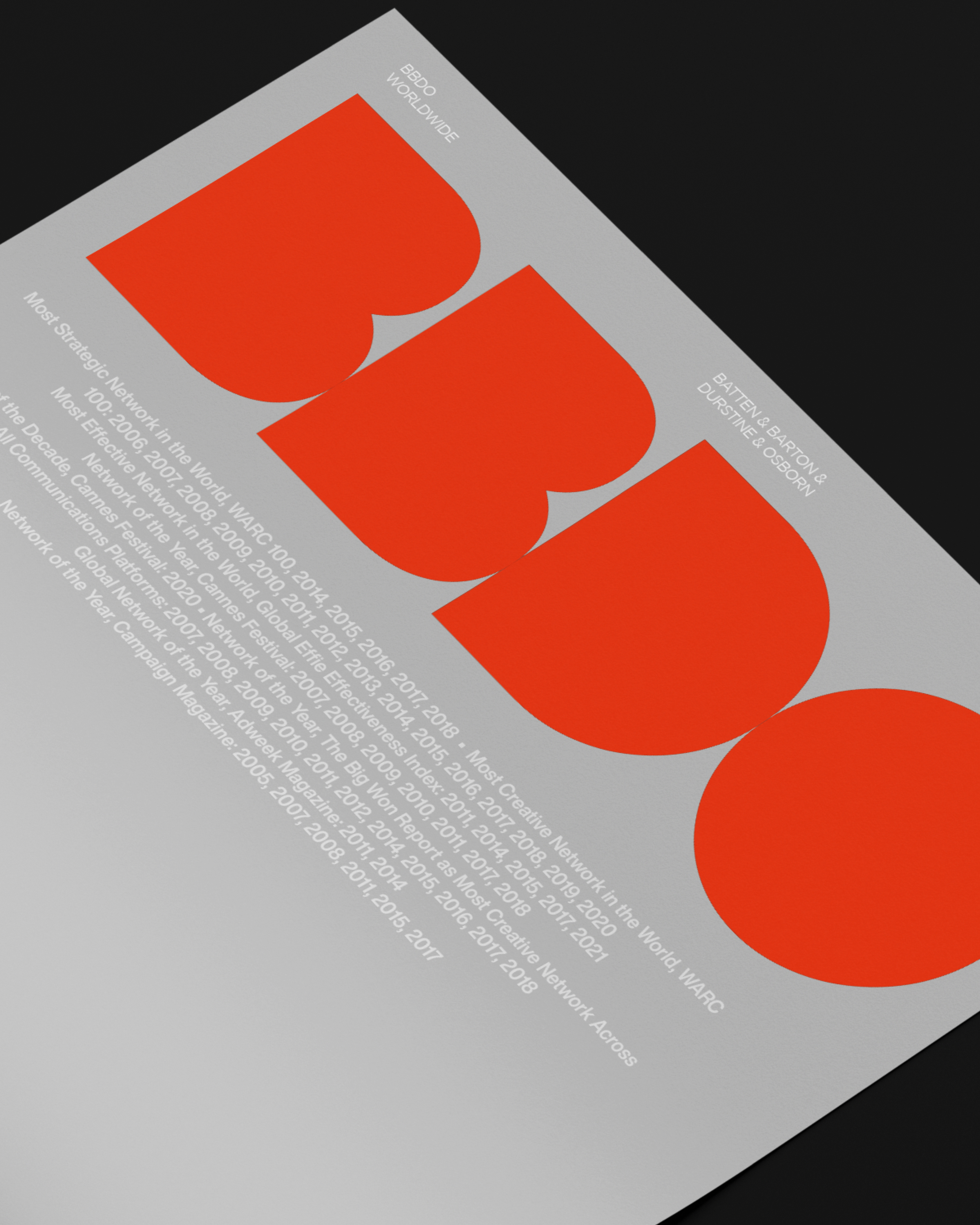
BBDO | REBRANDING
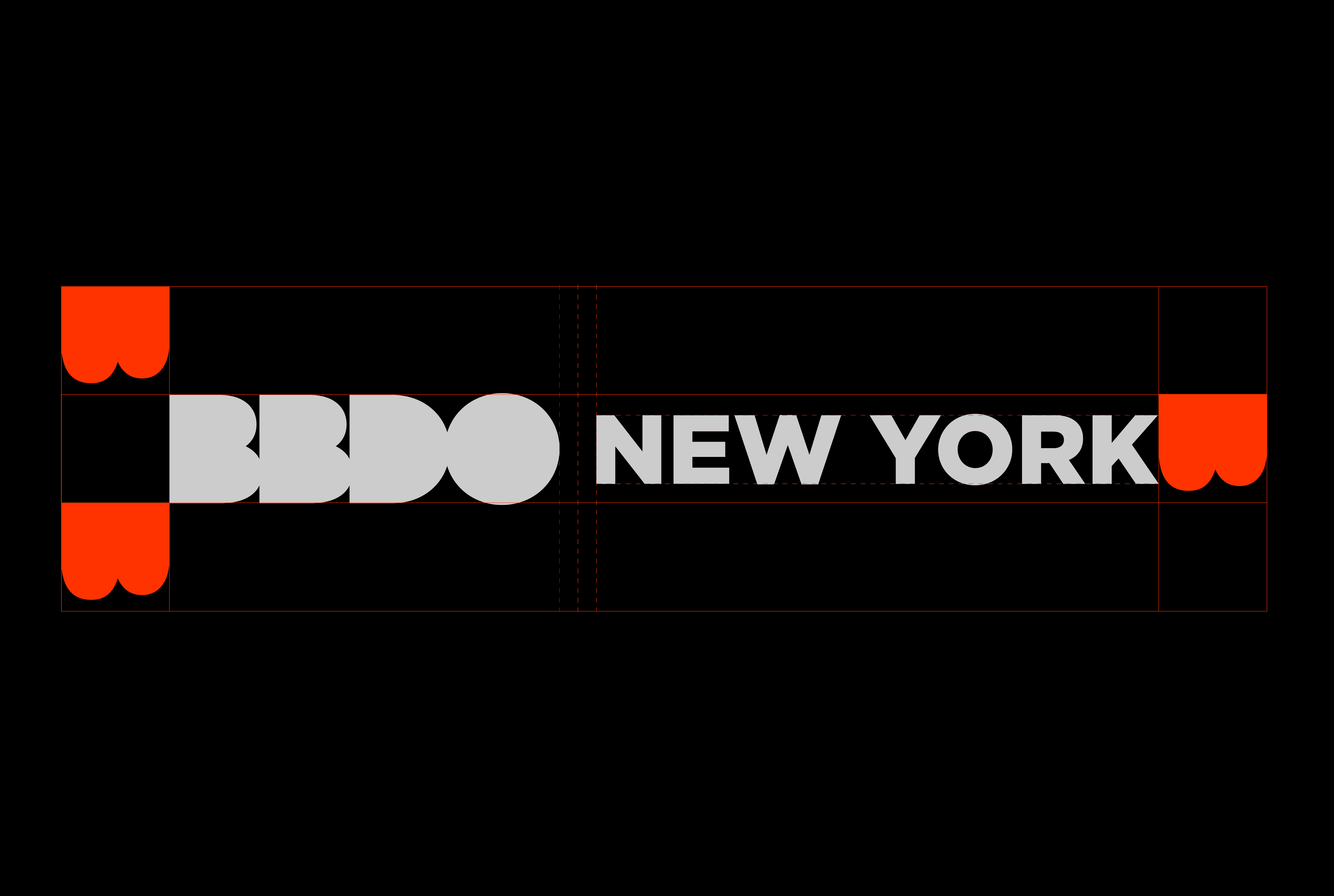
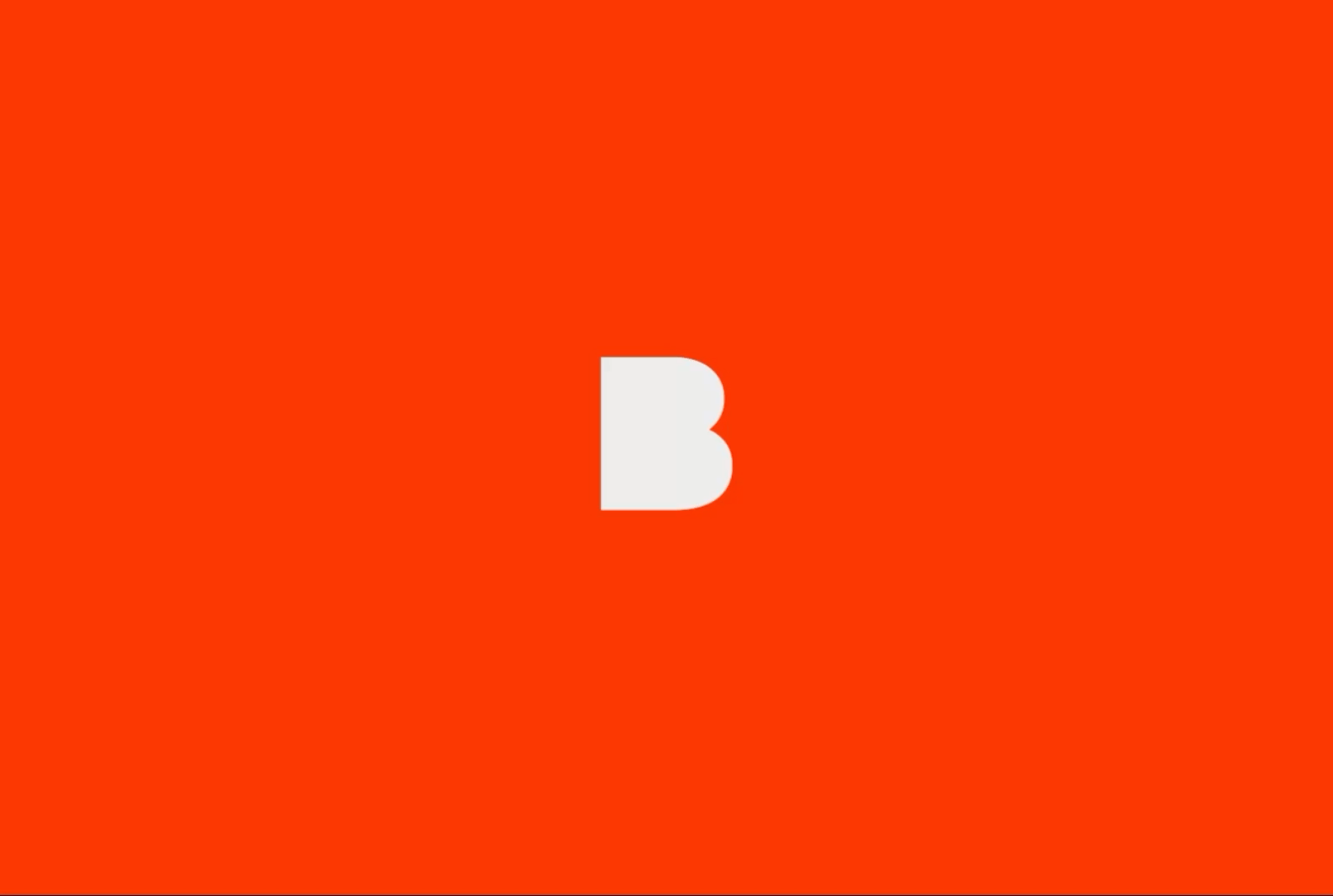
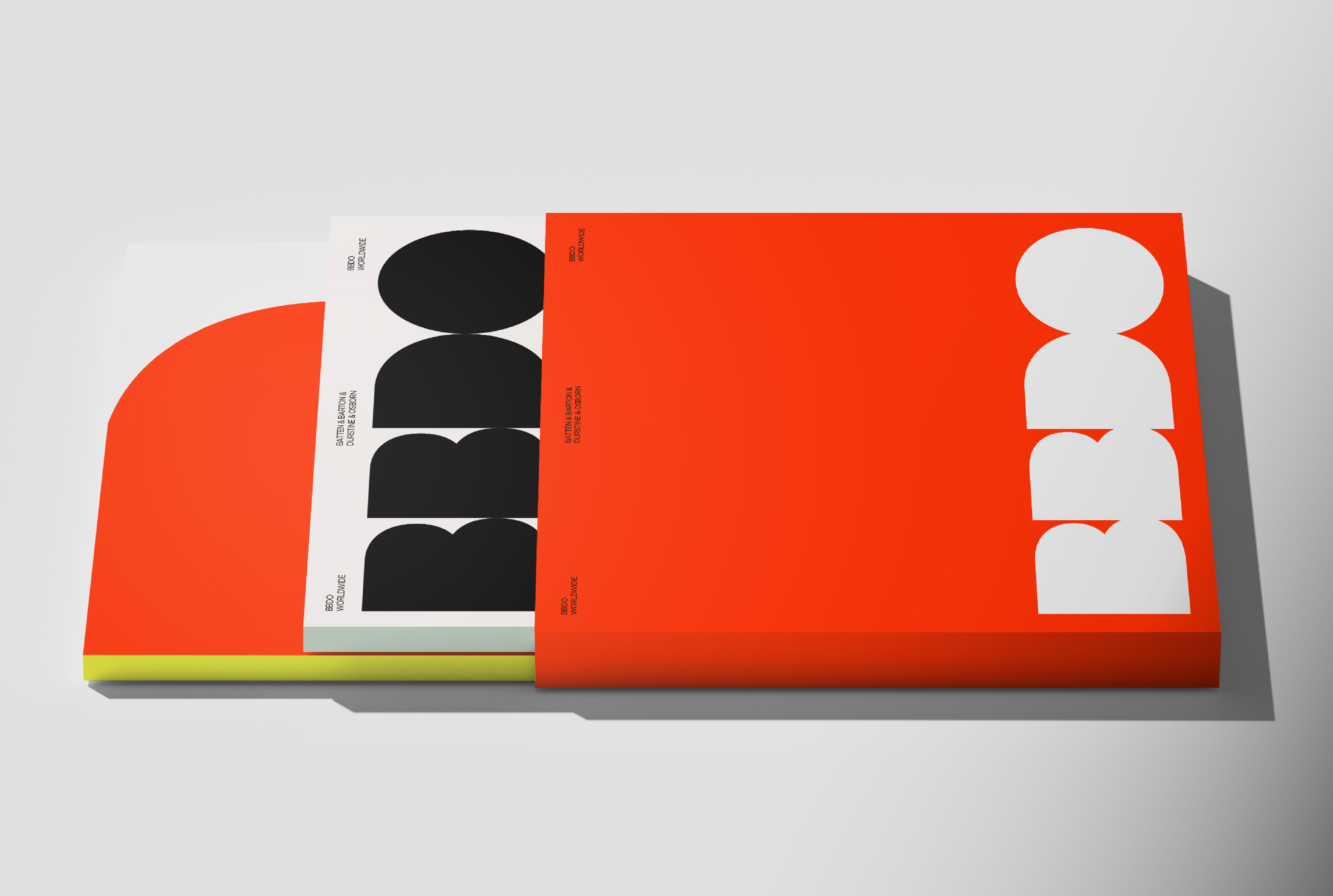
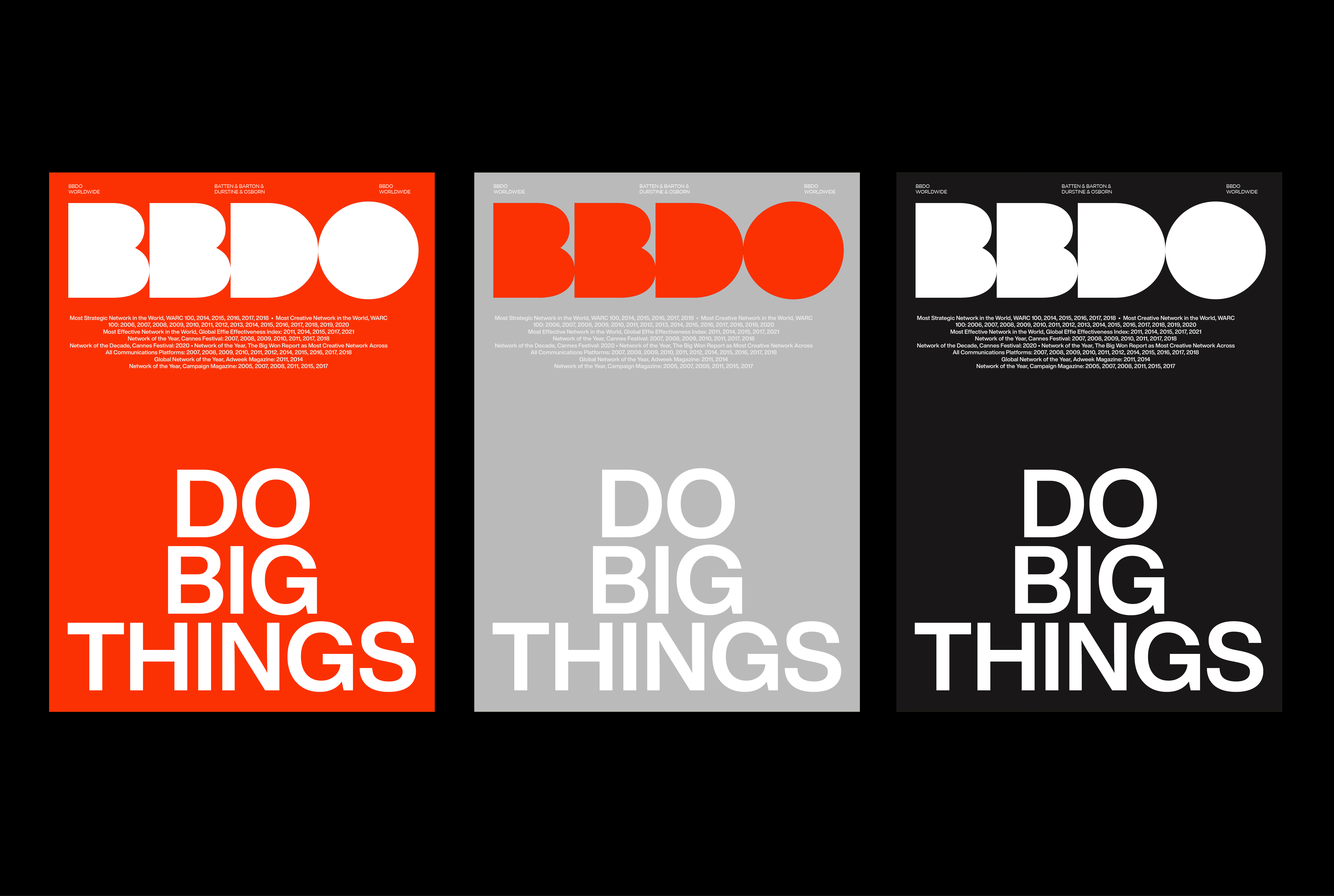
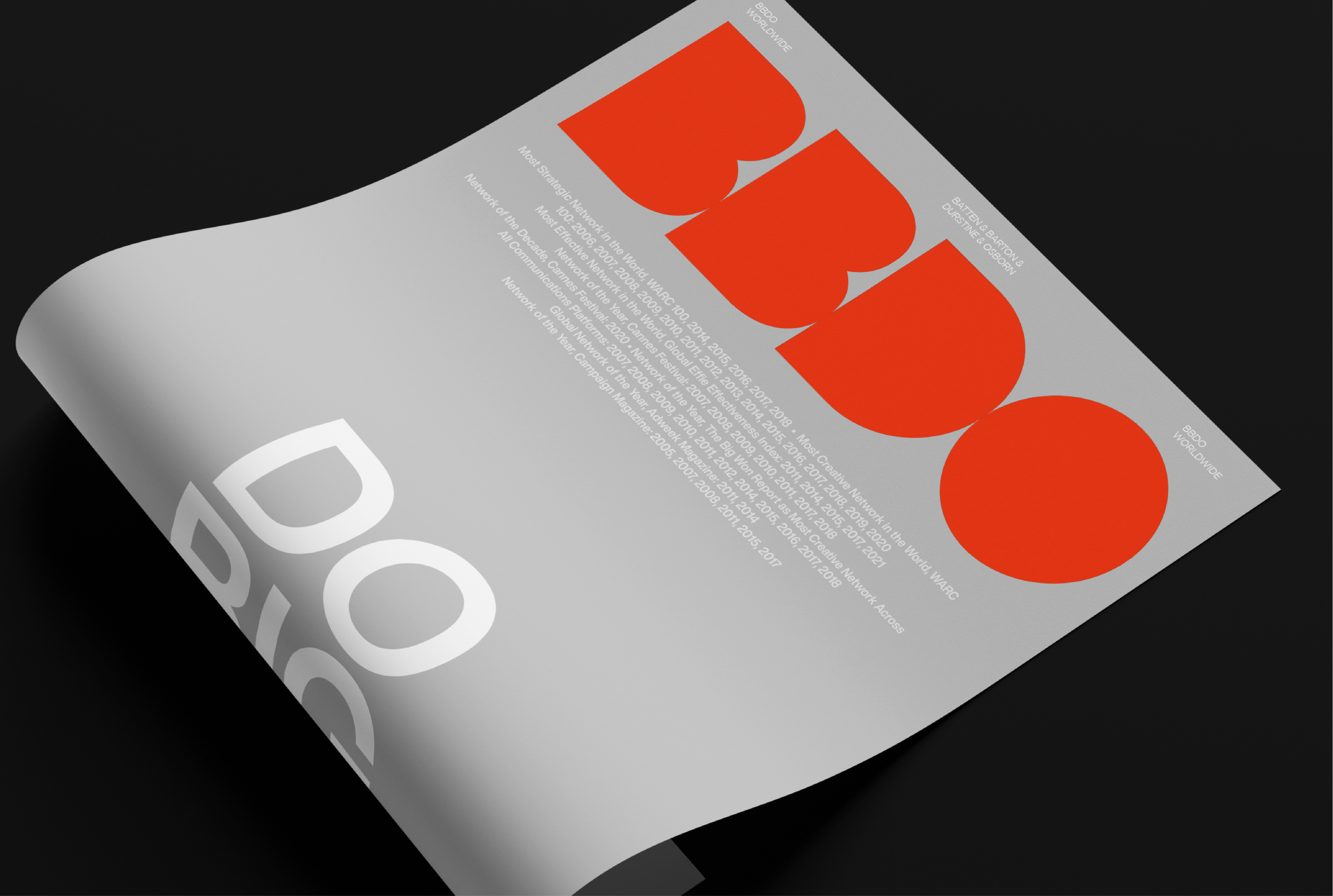
BBDO’s new identity begins with a precise graphic gesture: the removal of the counters in the letters B, D, and O. This formal decision establishes a visual platform that extends the role of the logo, transforming it into an active structure capable of highlighting and framing the brand’s content.
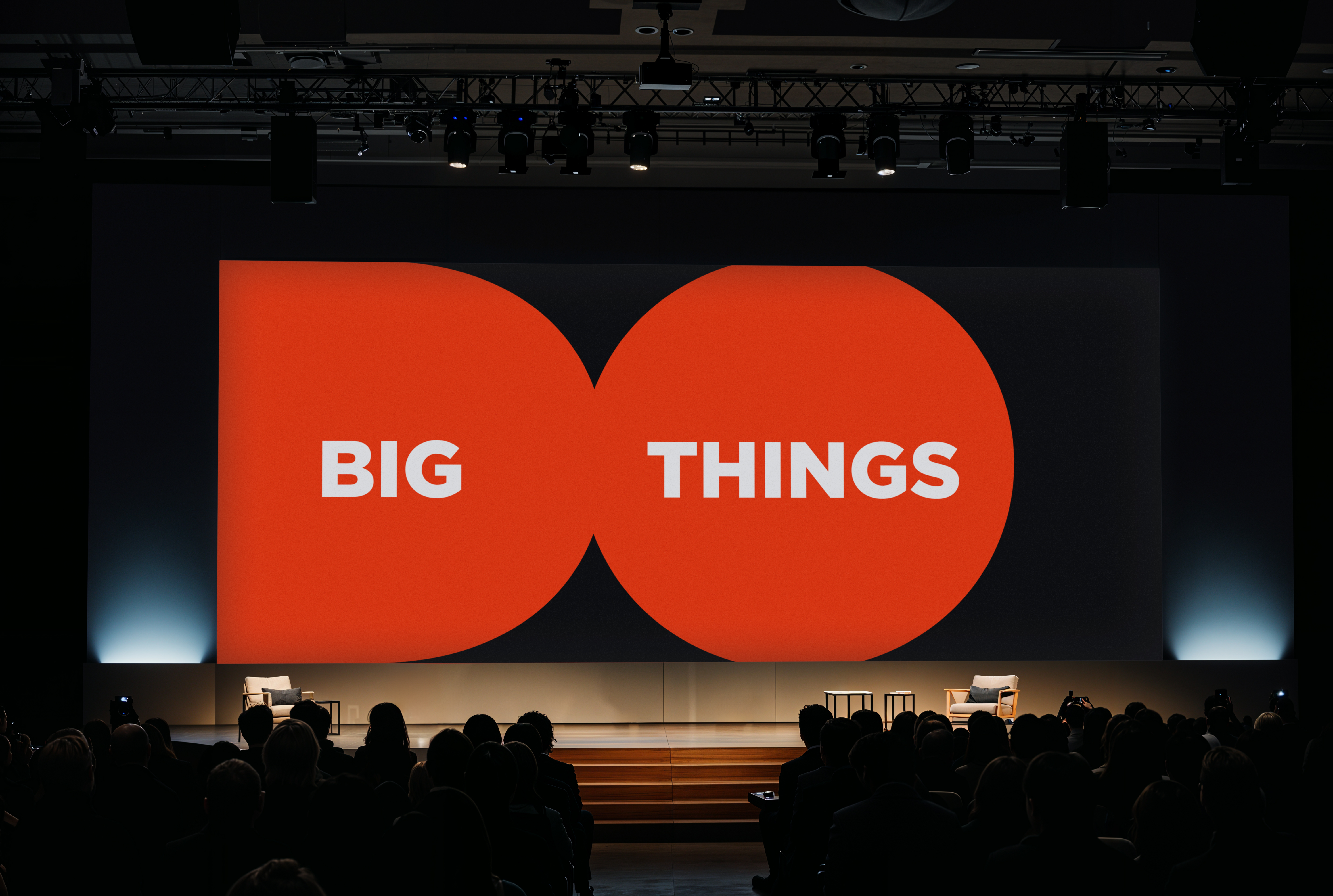
More than an aesthetic update, this graphic system reflects the agency’s new global positioning — moving beyond the long-standing mantra “The Work, The Work, The Work” to embrace a new directive: “Do Big Things.”
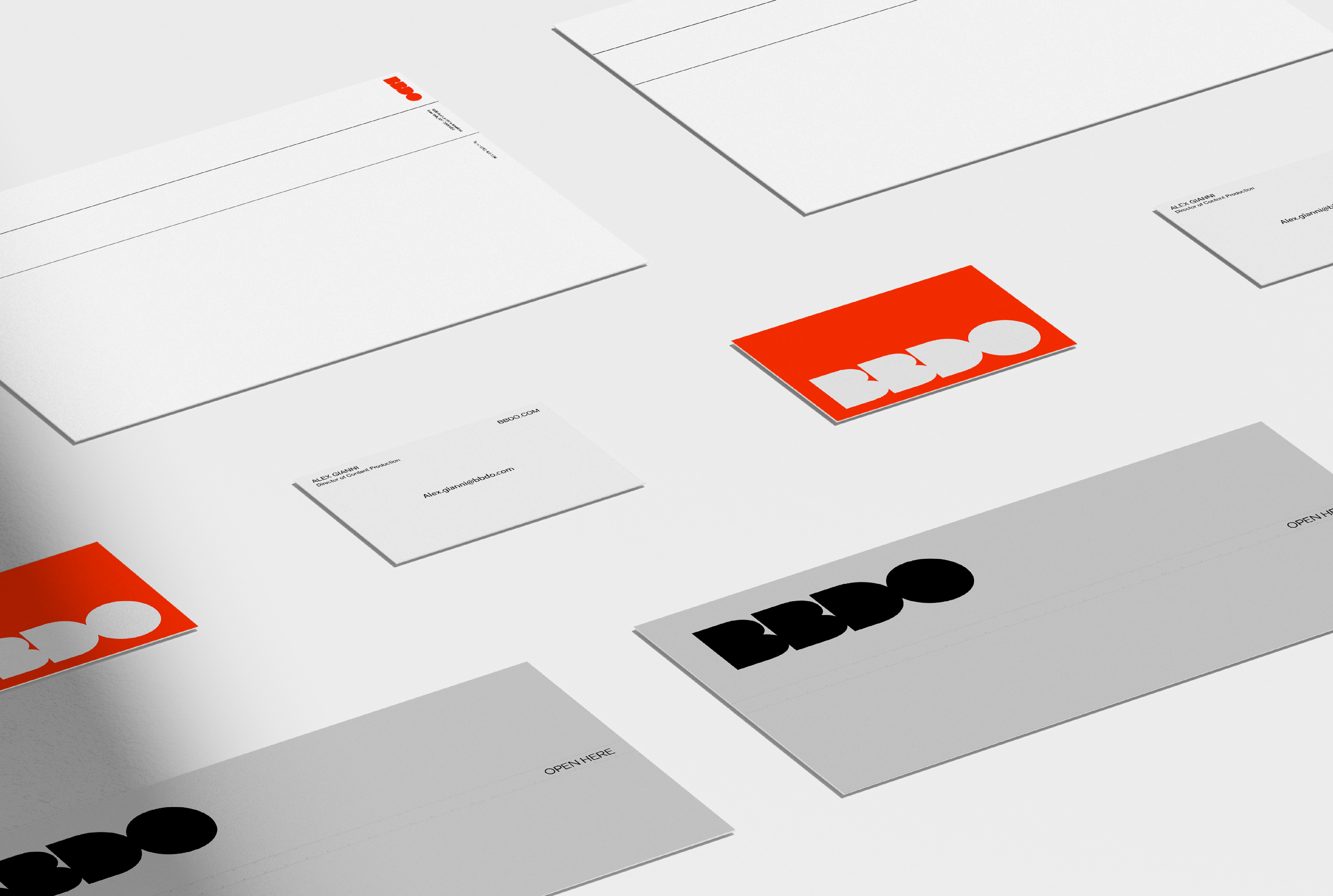
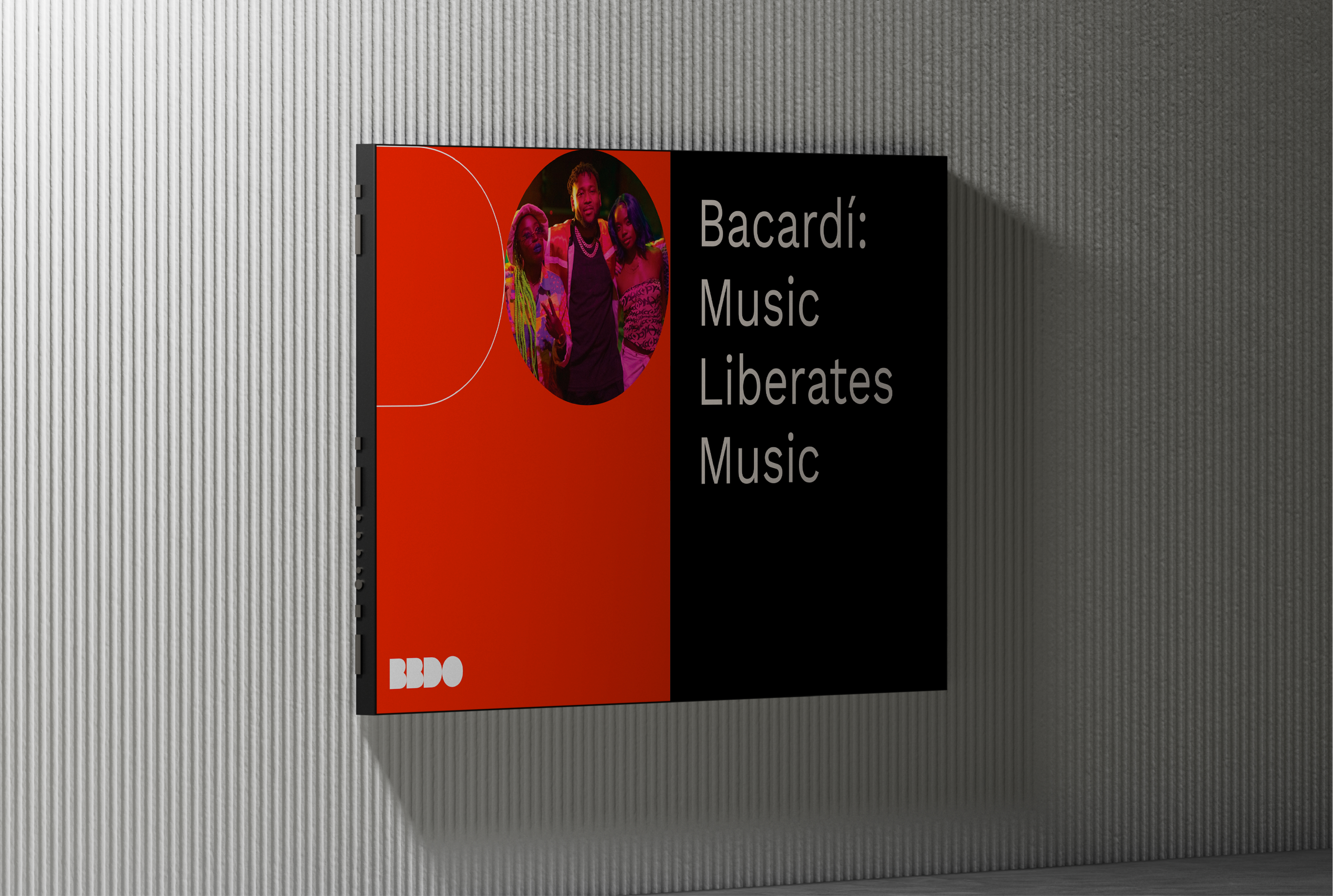
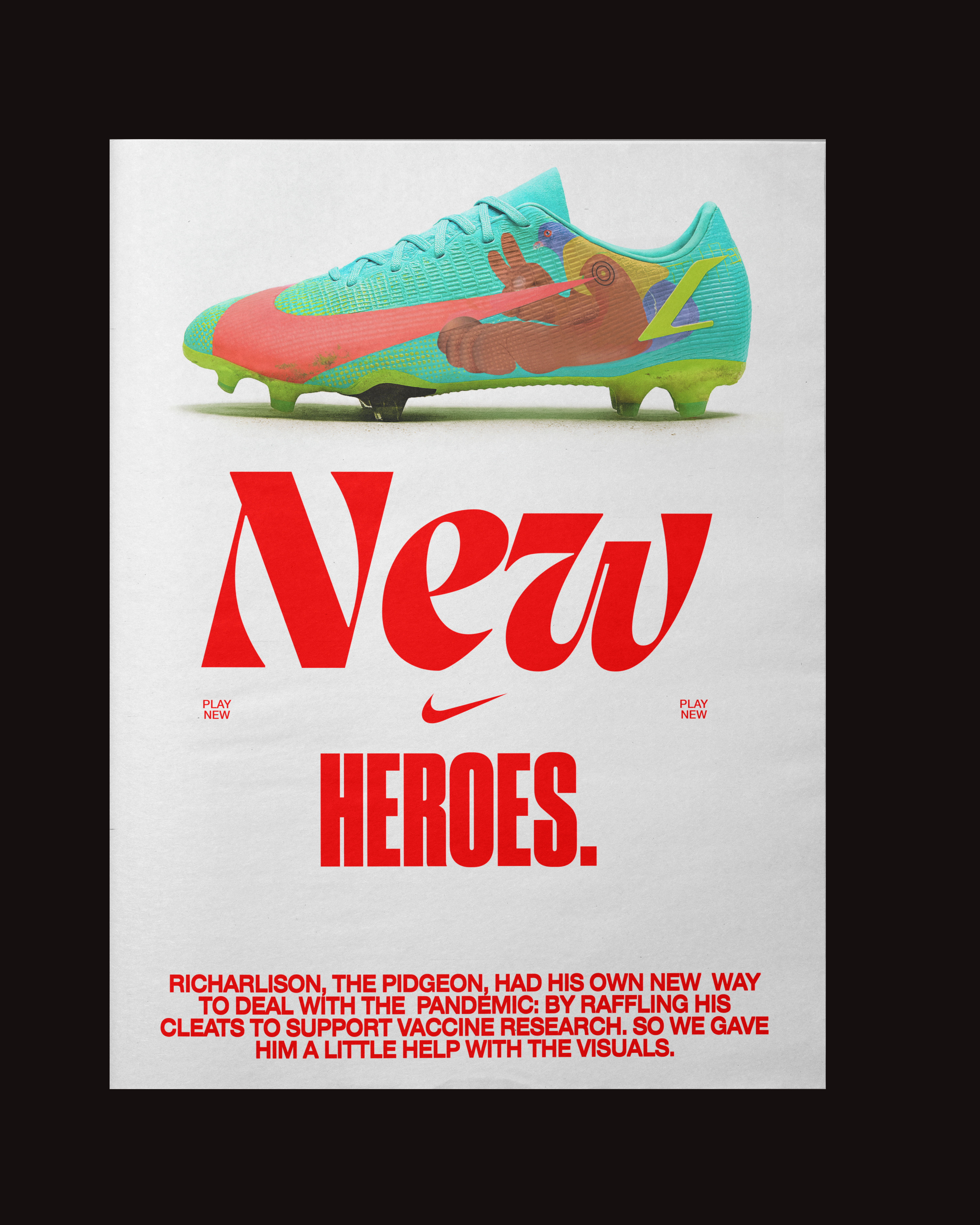
The new logotype was designed to emphasize what lies behind the initials: plural ideas, diverse teams, and bold results. Its simplicity allows flexibility and adaptability across various applications, while the visual elements derived from the logo — such as masks and graphic cutouts — act as devices to bring focus to the agency’s work and narratives.
This visual system is built to balance consistency and expression, maintaining a recognizable yet flexible identity — aligned with the ambition to challenge, move, and do big things.
Role: Head of Design
BBDO NYC
CCO: Luiz Sanchez
ECD: Humberto Cunha
Designer: Gabriel Mello Franco
Motion: Lobo