ASSIGNMENT
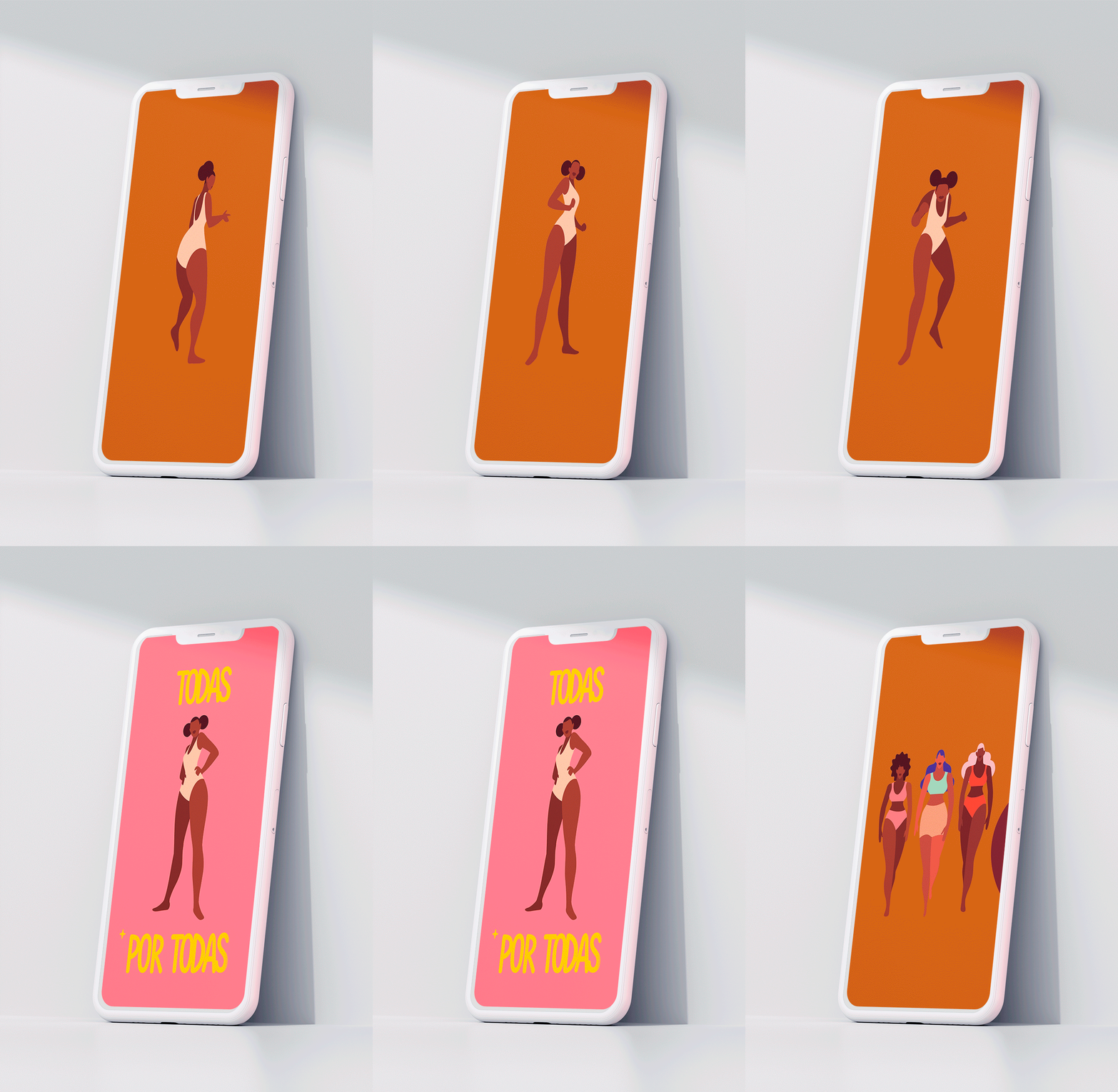
limited edition packs especially developed for the PepsiCo
SOLUTION
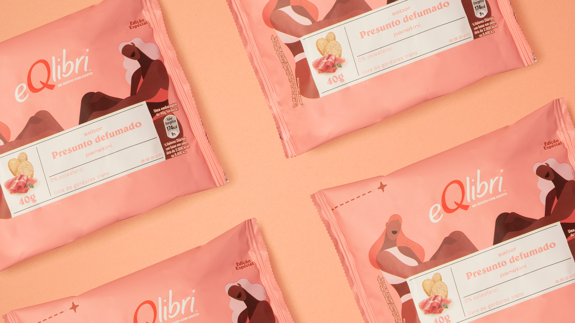
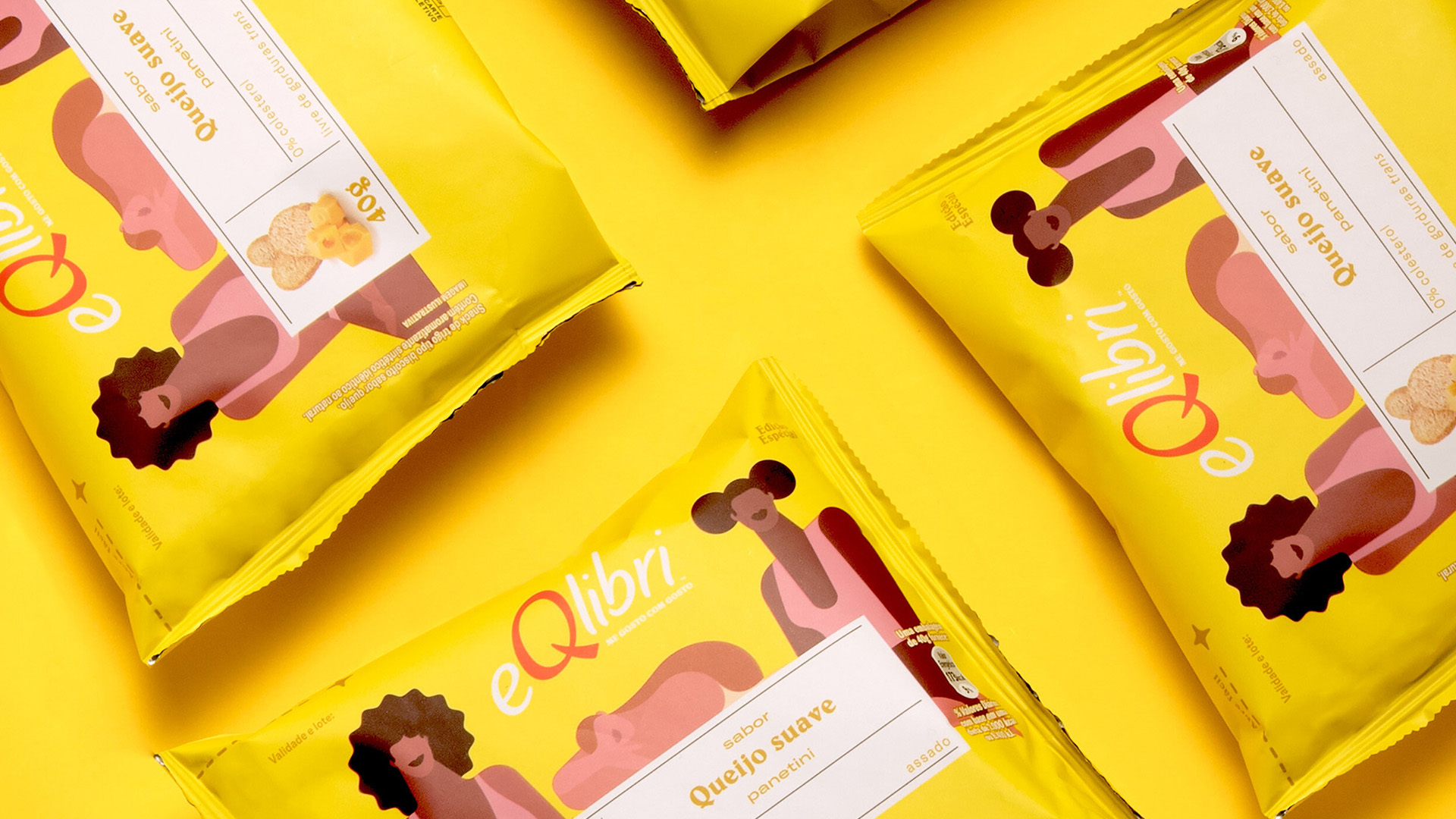
To make clear the positioning, we created a special edition representing women of all accents, colors and shapes at the most important point of a brand: its own packaging. After several studies in the category, we found a little explored territory in the packaging and we built a system of labels to unify the six flavors. We invite the illustrator Helena Sbeghen to perform the art of packaging.
To make clear the positioning, we created a special edition representing women of all accents, colors and shapes at the most important point of a brand: its own packaging. After several studies in the category, we found a little explored territory in the packaging and we built a system of labels to unify the six flavors. We invite the illustrator Helena Sbeghen to perform the art of packaging.
PROCESS
From the original format We gave them a new look by bringing hierarchy in the information and a more attractive color palett


Pepsico Packaging Design and Launch Campaign
eQlibri is a Pepsico snack brand that talks to women about having a balanced life and self-
acceptance.
←Previous
eQlibri is a Pepsico snack brand that talks to women about having a balanced life and self-
acceptance.
←Previous
Client:
Pepsico
Agency: BETC SP
Role: Packaging Designer and Art Director
Recognition: Cannes Lions - Shortlist
Cresta Awards - Silver
São Paulo Creative Club - Shortlist
Next →
Agency: BETC SP
Role: Packaging Designer and Art Director
Recognition: Cannes Lions - Shortlist
Cresta Awards - Silver
São Paulo Creative Club - Shortlist
Next →